

Short Order Crooks teaser F
This quote sums it all up. And I liked the idea of just slopping pasting the logo over said customer's face, a hint of stuff that's to come.

Short Order Crooks teaser E
I had another Wolfgang Puck quote in the mix but it was longer and a bit more existential. I like this quote, felt fitting for a book about mistakes.

Short Order Crooks teaser D
Dunno. This one just felt like it worked.

Short Order Crooks teaser C
Sure, this is a book about losers, or people who see themselves as losers, but we have jokes in it too. The contrast of Julia Child's upbeat nature with our main character's downbeat lifestyle felt like a fun bit of a smirk.

Short Order Crooks teaser B
This is David Chang talking about his restaurant, but it was only after the fact that I realized that it kind of applies to our Kickstarter too. What's a more overt Freudian slip? That's the magic of design, kinda like writing in that weird bits of you leak out when you least expect.

Short Order Crooks teaser A
Some design projects I have concrete ideas about when I approach them, some things I just wing it. This is a winging it affair. The arrangement with the logo and tagline and kickstarter info were all pretty easy, but it felt like it needed something else. That's when I thought about getting a quote from a chef that sort of applied to the story we're telling.

Social Justice War Boy
This phrase came to me in a dream, or sleepwalking. Anyhow, I made a shirt of it to help cover my Portland rent increase.

Heartthrob Quotes
Assembling a wall o' quotes for our book Heartthrob. Nice people saying nice things. It's not that hard.

Heartthrob 8 Track
This took a lot of finessing. I was going to replace all the text too, but honestly, I did so much work making the 8-track look right and moving stuff around in the ad to get it right that I figured that was good enough.

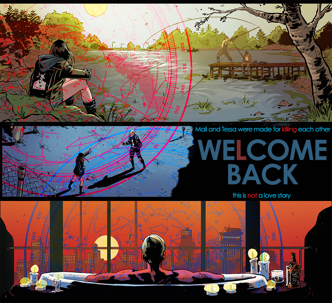
We(l)come Back via Heartthrob
if you can't homage your own book, what can you homage?

We(l)come Back via Hellboy
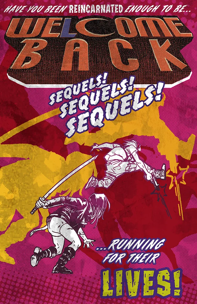
One of comics' more distinctive logos, someone even made a font of it, tho i had to adjust a few letters. And thankfully we have old-timey violence that works well in a Hellboy context.

We(l)come Back via Southern Bastards
Lotta red, some halftone, lot more red, someone being menacing.

We(l)come Back via Walking Dead
The logo seemed simple enough, but it wasn't. The image seemed pretty Walking Dead, minus zombies. We don't have those.

We(l)come Back via Bitch Planet
The toughest one of the bunch, mostly due to reverse engineering Rian Hughes' logo and his fonts. Once that mind-shredding task was finished, the rest was fairly simple to sorta replicate.

We(l)come Back via We Can Never Go Home
Luckily we had people holding hands. Plus I stole the legs from the original cover because ours were cut off. Super happy with this one.

We(l)come Back via Sex Criminals
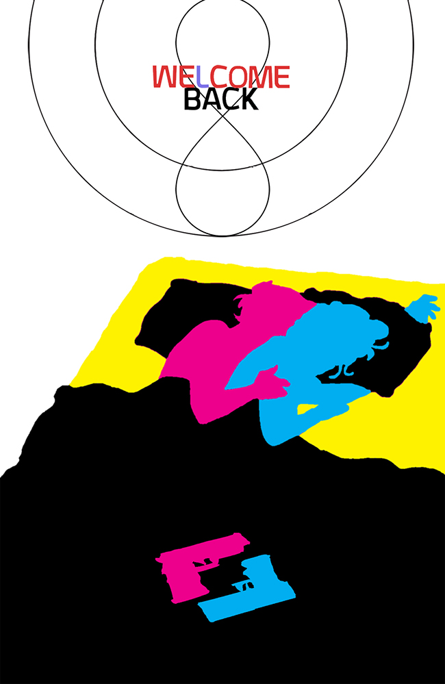
Changed the brimple with an infinity symbol. Used the first arc's CMYK-ness. This wasn't easy but it was fun.

We(l)come Back via Saga
90% logo here, and that was just a font thing. The rest was as close as I could get. This hits a little harder if you know the context. Maybe the easiest of the bunch.

We(l)come Back via The Wicked + The Divine
The inspiration for it all. It took a bit to get some of Matt Wilson's smeary color effects and I totally failed but this was close enough for comfort.

Heartthrob EKG
I thought of this very early on as we were working on the book. Two main characters who share a heart and two EKG readings that form a heart. Took forever to nail it, but very happy with the results.


The Soldier
Promo image for WE(L)COME BACK #1 - was stuck as stuck could be. Not a lot of variety in reincarnation imagery. Lotta circles and spirals and the like. But then I got to thinking about destiny and divination and tarot cards suddenly made all the sense in the world.
This one was made in response to the Tessa one. Mali gets the more badass title but is surrounded by the mundane. The doublesided dog-in-cape is something I'm proud of.

The Target
Promo image for WE(L)COME BACK #1 - was stuck as stuck could be. Not a lot of variety in reincarnation imagery. Lotta circles and spirals and the like. But then I got to thinking about destiny and divination and tarot cards suddenly made all the sense in the world.

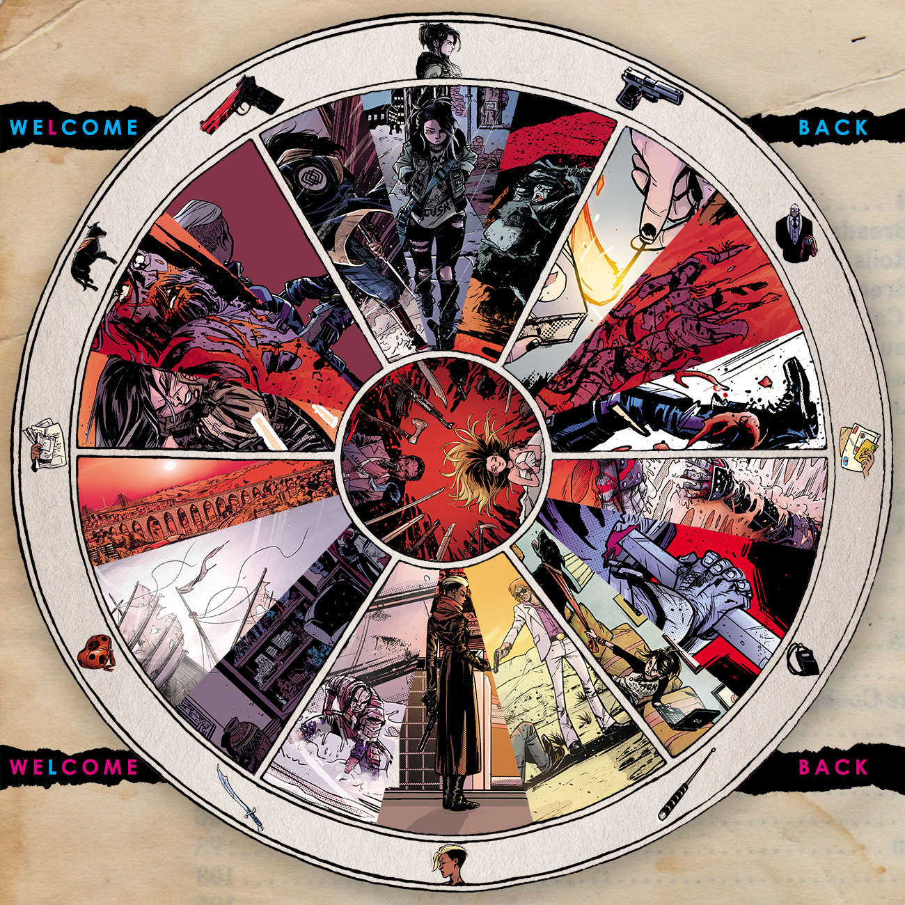
WE(L)COME BACK - Wheel of Life
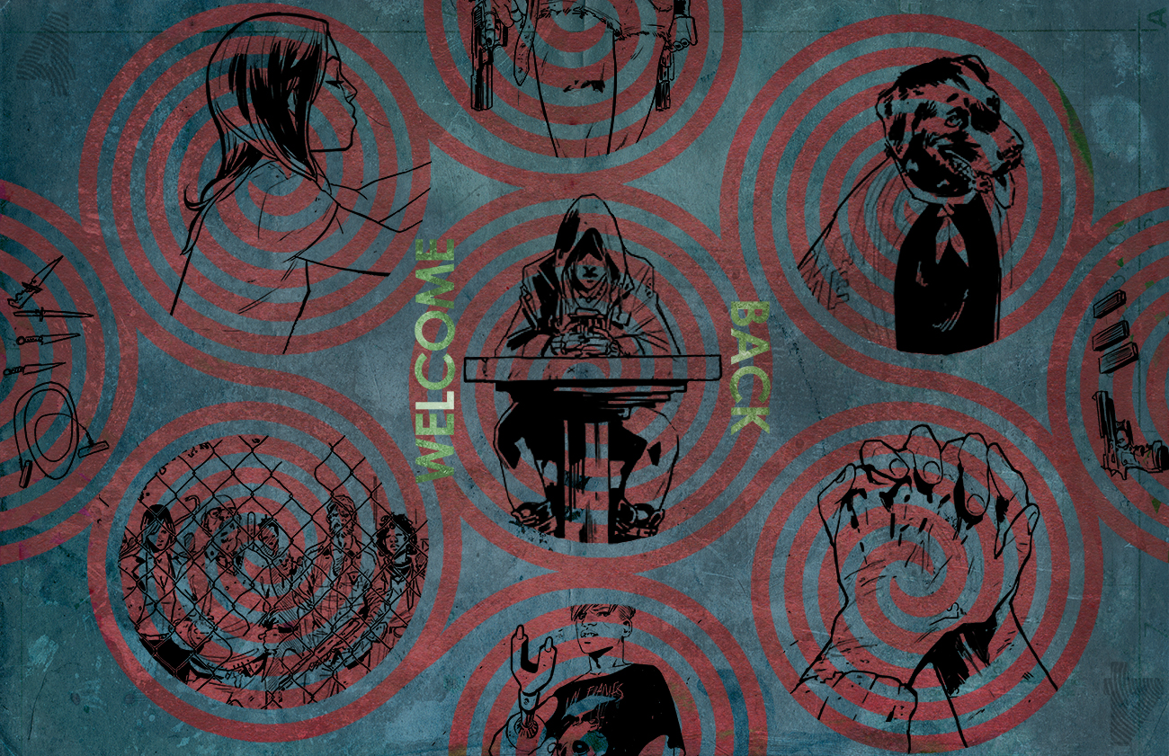
In keeping with the design scheme of the book, this was a riff on the Tibetan wheel of life, only more geared to the warring Sequel lifestyle. I seem to be good at making things fit into weird spaces, and this had a lot of spaces to be filled. The background was sort of a last minute decision, but those are when the best decisions show up.

WE(L)COME BACK pre-orders
A quick and dirty pre-order image for WE(L)COME BACK #1. Just wanted to make it clean and simple and show off some imagery that'd make it more appealing. Since the design for the book deals with circles, I went with circles too. Synergy!


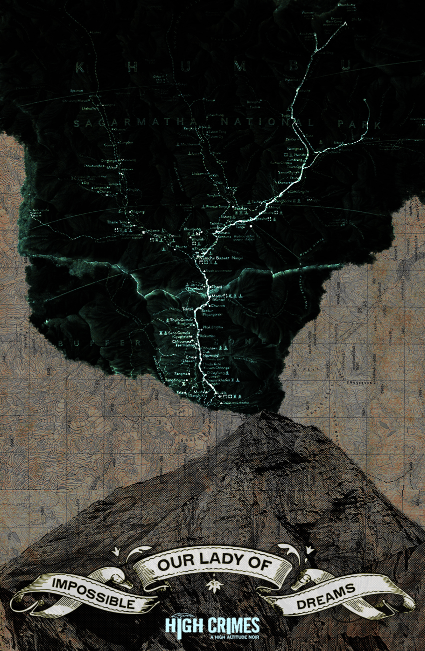
Our Lady of the Impossible Dream
And here's Everest again, with a nod to the ending of HIGH CRIMES, using a map within a map. This one is surprisingly popular, proving that I have no idea what people actually want, but if I throw enough stuff at the wall, one of those things is bound to click with someone.

Our Lady of the Five Rings
Five olympic rings, three medals, an oxygen valve and a compass. Then lots of blood. I might've gone overboard on the blood in retrospect, but they're HIGH CRIMES canonical, so I'm okay with it

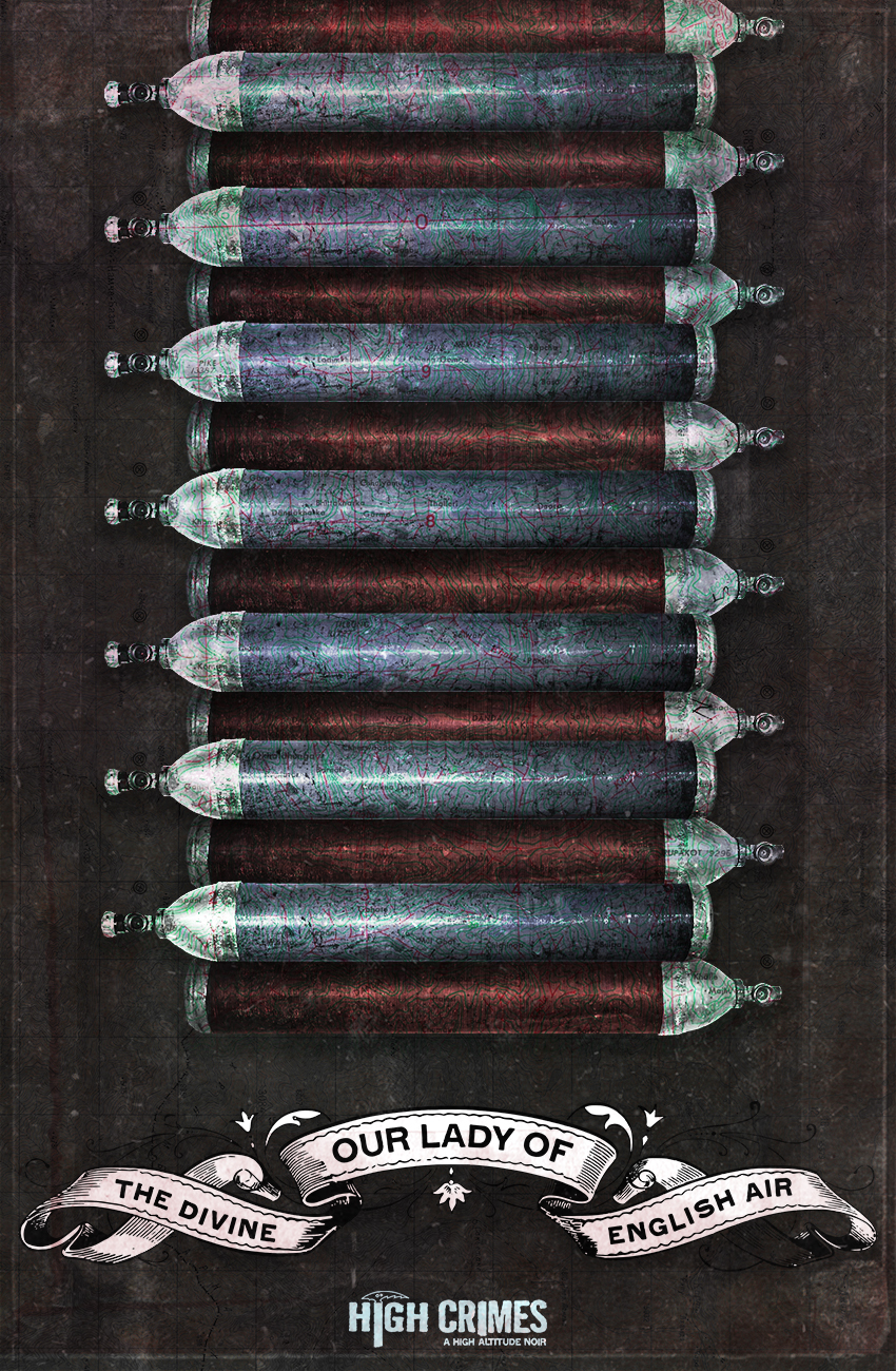
Our Lady of the Divine English Air
When bottled oxygen was first brought to Everest, it was jokingly called "English air" by the Sherpas who routinely climbed huge heights relying only on their physiology. I was sort of at a loss of what to do with them, though, until I thought of arranging them like belt-fed bullets. Probably the weakest of the batch, but I still like it.

Our Lady of Defensive Measures
When in doubt, arrange everything like a religious icon. Luckily I had three blades to choose from: Zan's folding knife, Mars' Ka-Bar and everyone's ice axe.

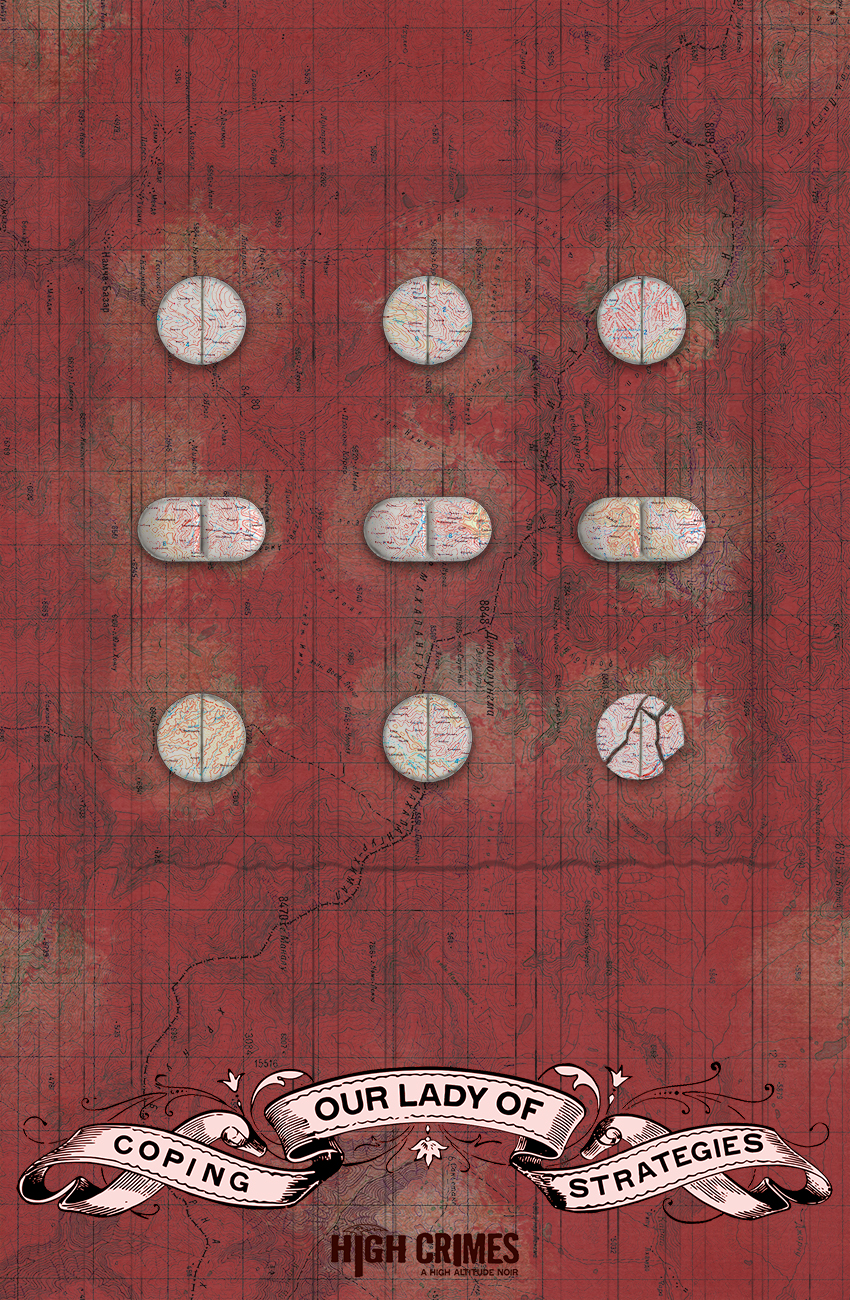
HIGH CRIMES: Our Lady of Coping Strategies
This one was hard, so I drew back, made it as minimal as possible. I always wanted to do something with pills but everything I had done involved lots of them and artful arrangements and, yeah, never worked. So I went the opposite route and used circular and longform pills to represent the dots and dashes of SOS. Ryan Ferrier smartly suggested I make one of the pills at the end broken, which I am grateful for and giving all due props to him. Anyhow, this probably took just as long as the others, so minimalism is its own special hell.

HIGH CRIMES: Our Lady of Close Calls
Continuing on with the patron saints of HIGH CRIMES theme I started with the previous piece, I knew the severed hand had to be next. Our own Hand of Glory. Nestled in a bundle of climbing rope with ascenders and carabiners for flair. This took forever but I'm really happy with it.

HIGH CRIMES: Our Lady of Perpetual Bad Decisions
Got ahead on a script so I spent a decent chunk of Sunday figuring this out and putting it together. I'd started something with the goggles forever and ever ago and figured, well, putting them on a skull was a good start. Then putting Everest in the lens, and then it turned into maps and bullets and microfilm inside of pill casings (which took forever, but I think came out well) as some kind of religious iconography sort of thing. Saints. Why not? So this is Our Lady of Perpetual Bad Decisions, patron saint of Zan Jensen.

Furry
Someone mentioned this on twitter and I guess I had something better to do, but that never stopped me before. 20 minutes later, I had this nightmare.

Think of City: 023
"Part serious architectural investigation, part international art collaboration, for fun, for eventual exhibition, to work together, to see what happens, Think of a City is a mass storytelling project. Join us on a Dérive to experience this city of the imagination, told page by page, by storytellers from around the world. We’ll take in the multiple scales and facets of urban life to build a communal tale."
I was initially supposed to collaborate with an artist but I couldn't make it happen with my schedule, so I offered to do one solo, having no clue what I was going to do. After a lot of scrubbed attempts, at the last minute I came up with this. With some much-needed help from Alison Sampson in the home stretch, it became this piece, which I'm pretty happy with.

Tall Tales Ad
Done as a promo for HIGH CRIMES #8, this took forever. I took the template, which was all about nursing and turned it into a crappy ad for the crappy adventure guide service that our main character Zan works for. Time to impact ratio makes it basically a bust, but I like how seamless it feels.

You Are Nowhere
A riff on the promo image for the first arc of DEAD LETTERS, I wanted to mess with it for the second arc, especially since we have a Groundhog Day-type opening for each issue, it made sense to do the same with the promo. It's all about burning and destruction and what lies beneath. Or something. It was fun to revisit and muck with it.

Christopher Sebela Banner
My first con banner, comprising DEAD LETTERS, HIGH CRIMES and GHOST artwork. Angles are fun. You're always sitting in front of your banner, so I just put the blah blah blah part at the bottom because spending money to have someone print that is never not funny.

Michael Moreci Banner
I'm only including this because I'm hopeful I can steal a google result or two from someone looking for Mike. But I'm also pretty happy with how I was able to make his idea of using the two of these images from ROCHE LIMIT and BURNING FIELDS (hi google!) work pretty nicely, and I'm happy with the font. That never happens.

Crosshairs
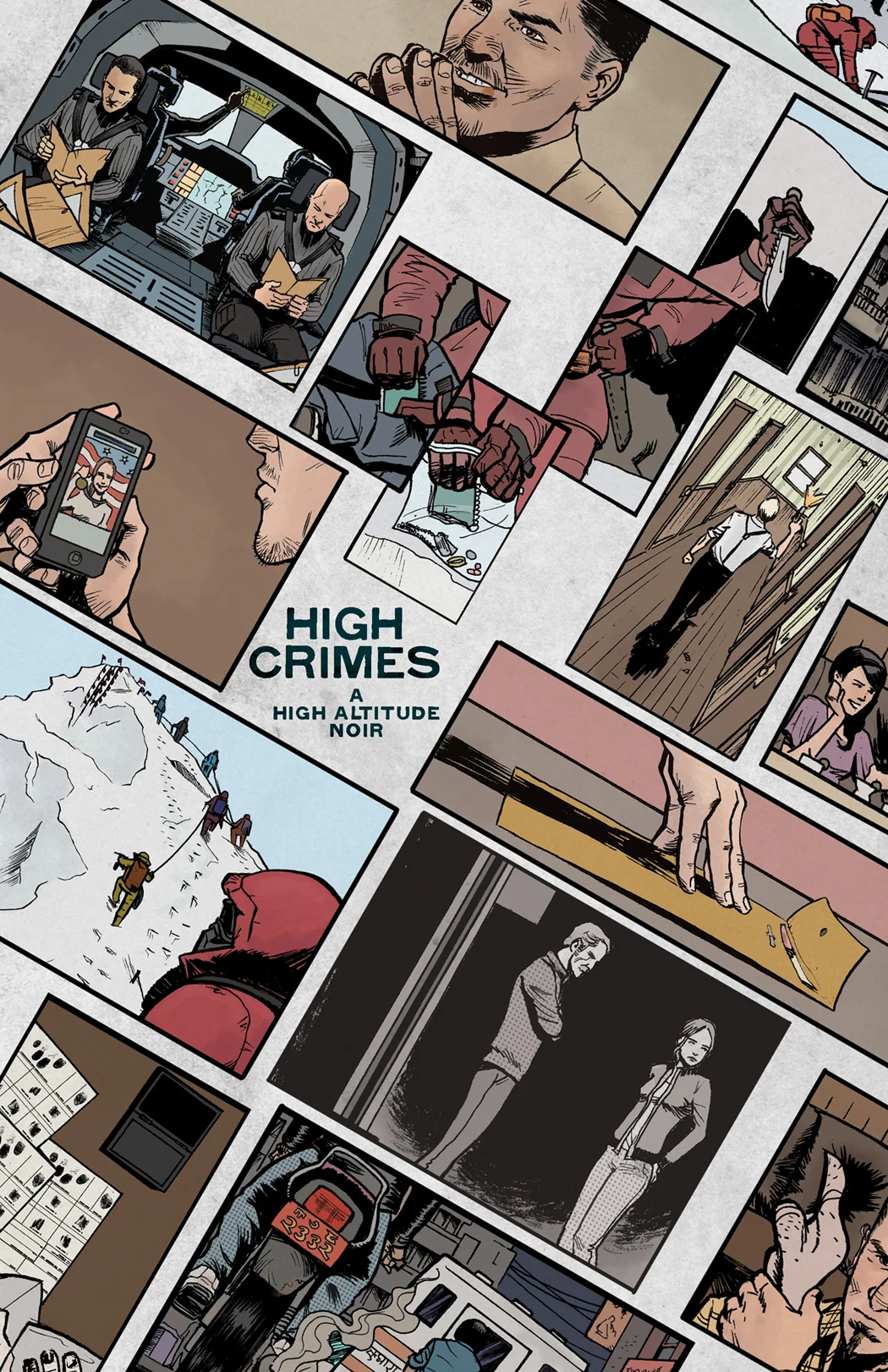
I did something similar to this for the 7 days of HIGH CRIMES promos before the first issue came out, but it was just stacking panels. This was harder because I had to fit all this stuff into these semicircle segments, but as a fan of the old BUCK ROGERS tv show, I was determined.
Took some clone brush trickery to make it all come together, but it was totally worth it. Still one of my favorite promo images.

You Are Here - Dead Letters #1
Designed as a promo image for the DEAD LETTERS lead-up, I was in disbelief when my editor asked if they could use it as a variant cover for the first issue. And pay me for it. So I offered to make it a wraparound for no extra charge because I've always wanted a wraparound cover.
So now I can credit myself as a comics cover artist and not be accused of being a huge liar.

Choose Your Own Adventures (Front Cover)
I grew up with these and something pinged in my brain. The hardest part wasn't all the typography (though trying to get that canadian price difference idicia running up the left hand side was terrible), it was trying to make a cover image that sort of summed up what Choose Your Own Adventure book covers felt like. It's not completely there, but it was close enough that I was happy to sign off on it and release it into the world.

Choose Your Own Adventure (Back Cover)
Super easy, compared to the front cover and lots of fun writing in the bombastic weirdo CYOA style.
For the amusement of me and only me, I changed one of the UPC codes to the one from the Tommy Tutone song.


High Crimes Pulp
A riff on pulp novels and men's adventure magazines using images from the book put together to look more lurid and stuff. I painted it all by hand using some strange brushes and very blotchy, rushed style, which felt appropriate. The tagline was fun, I seem to excel at diving deep into stupid taglines. Then finish it all off with some trompe l'oleil distressing and you've just created a promo image.


Hand Clock
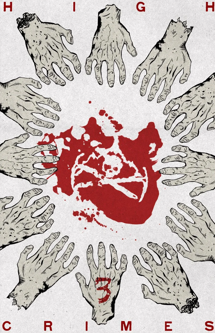
For issue 3, I resurrected Brian Churilla's gifted hand drawing and my two warped clones and just made a clock of them. Parts of the hands getting cropped off was a fortunate way to deal with so much hand sameyness. I'm still proud of the shape of the blood logo.


High Crimes Movie Poster
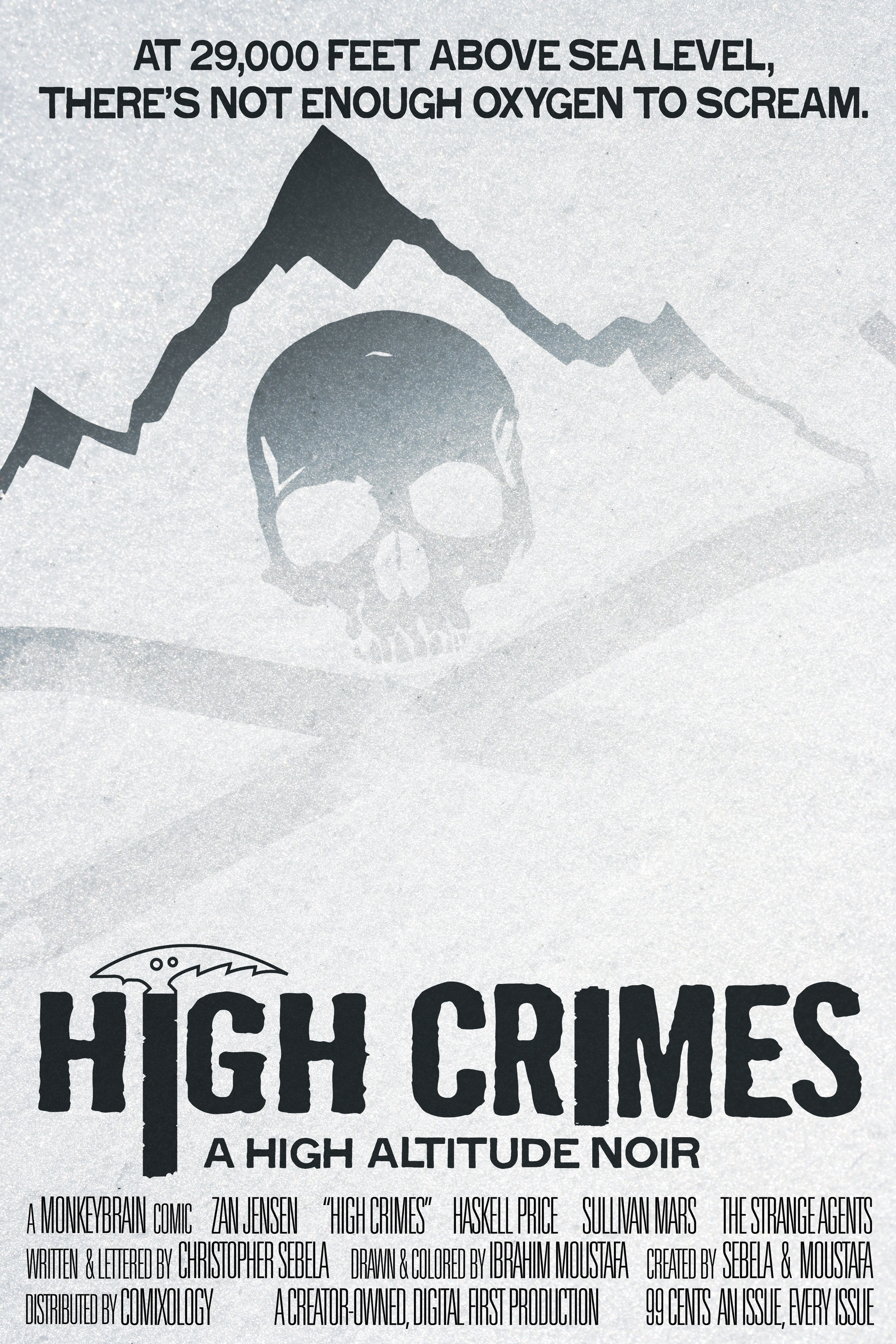
I had this stupid tagline pop into my head and I'd just gotten a new computer so I wanted to try it out in style and made this movie poster for High Crimes. Pretty simple, really. The effect on burying the logo in snow could've been done better, but I never said I was great at this.


1 Mountain
Everest herself. Makes sense for the last one, the one one, to be Everest, no obstructions.
But I couldn't resist and had to slap a NICE PRICE sticker on it and a 99 cent price sticker. That speaks to a lack of restraint on this piece as a whole, but I went for it and I rarely regret it.

2 Partners
I was at a loss here but I knew I wanted to highlight Haskell and Zan as partners. Plus I realized no one had really seen much of Ibrahim's art, so this was a way to kill 2 birds with one stone. This is where my Rearranger skills come in. This piece got a good reception, so my impulses aren't entirely garbage. Yet.

3 Hands
I'm friends with artist Brian Churilla and I texted him in a semi-panic one night asking if he could draw me a really good severed hand. Actually, I got ballsy and asked for more than one, but he was on deadline, so one was all I got, but it was an amazing get. I had to warp each hand in photoshop, changing the shape of fingers, stump configuration, etcetera.
I dunno that I even envisioned the money under each hand when I came up with this, but I think it's what was missing. The whole melding of real world objects and artistic objects is a pretty fine line, but this one isn't embarassing. So... success?

4 Targets
Found this hi-res full page of classified ads from the 50s or so and I'd had this idea of the Strange Agents using these tiny classified ads to recruit new Agents. Then that turned into coded messages, so I spent way too long going through and circling certain words to try and create a provocative-ish list. Stapling the photos of Zan, Haskell, Tenzing and Mars was a last minute addition, as was the map with Nepal carved into it. It's another kitchen sink approach that I like to believe came together far better than I ever expected.

5 fingers
Severed hands are a big touchstone, as are handprints, so 5 was easy enough. Originally I was doing this just as the coroner's form and the WHERE IS SULLIVAN MARS tagline-type thing I got hung up on and the handprint showed up. Then I got the idea of replacing the lines of the palm with a street map of Kathmandu. Lots going on, so I guess I can't be blamed for this basically being a left handprint instead of a right handprint. It still makes sense to me that it's a right handprint, but I'd have to tell you in person.

6 Chambers
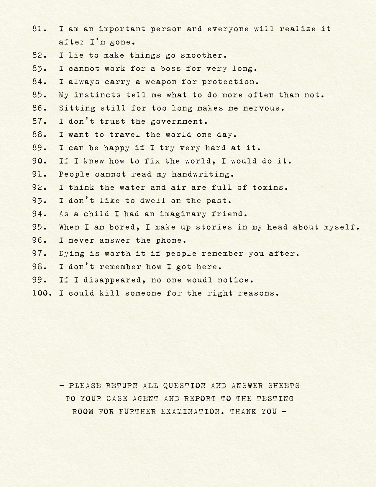
6 was a killer. The only thing I could come up with was 6 chambers in a revolver, but that was a stretch to make it really tie into the book in a meaningful way. Somehow it transitioned into the redacted memo (a concept never far from my mind) and the barrels of the gun as decoders. Some ideas show up because they have to, I've learned to shut up and be grateful.

7 Summits
8 Days before HIGH CRIMES #1 came out, I came up with the brilliant idea of doing a week long countdown to the book coming out. And to make things even more complicated, I would make sure that there was a numerical equivalent in the image that matched to the day.
7 was easy. The 7 Summits is one of mountaineering's most showboaty accomplishments, so I put all 7 summits on there, matching their heights as closely as I could, just to show the majesty of Everest. This is where I fell in love with this font (Gothic 520) and it became the house font for the book.
A lot I'd change, but for a first promo for a book, I think it did the trick.

Captain Marvel Flight Plan
A preorder form for Captain Marvel #1 I did for Kelly Sue DeConnick. A standard (for me anyhow) recreation piece, trying to make it look as close to whatever I'm riffing on).
Futura all the way, because Futura, and because the original font on the form was crappy or I couldn't match it up enough.


